Celebrating the cultural richness of olive oil, as a staple of one of the world's healthiest diets
Vita aims to challenge the negative perception of oil in diet culture. Despite being high in fat, olive oil has been a staple of some of the healthiest and longest-living cultures in the world. The inspiration behind this project was to remind even the most health-conscious customers of the benefits of incorporating olive oil into their diets.

Market research of common supermarket olive oils showed me that most packaging felt dated or dusty. Yellows and browns made the olive oils feel unhealthy or unclean. Loud typography felt overbearing and complicated to understand. It became clear that a more fresh and minimal approach would help Vita stand apart from the crowd.

Sketches of potential bottle designs
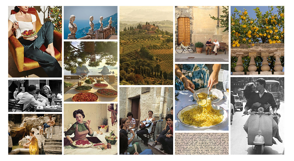
Celebrating La Dolce Vita
The word vita is known for the phrase "la dolce vita," a phrase that inspires enjoyment, of life… and the finer things in it. Vita becomes a synonym for passion, quality, and simple delight. The brand must be shining with a classic Italian charm and warmth that makes every customer feel at ease.
Key words: Quality / Tradition / Delight
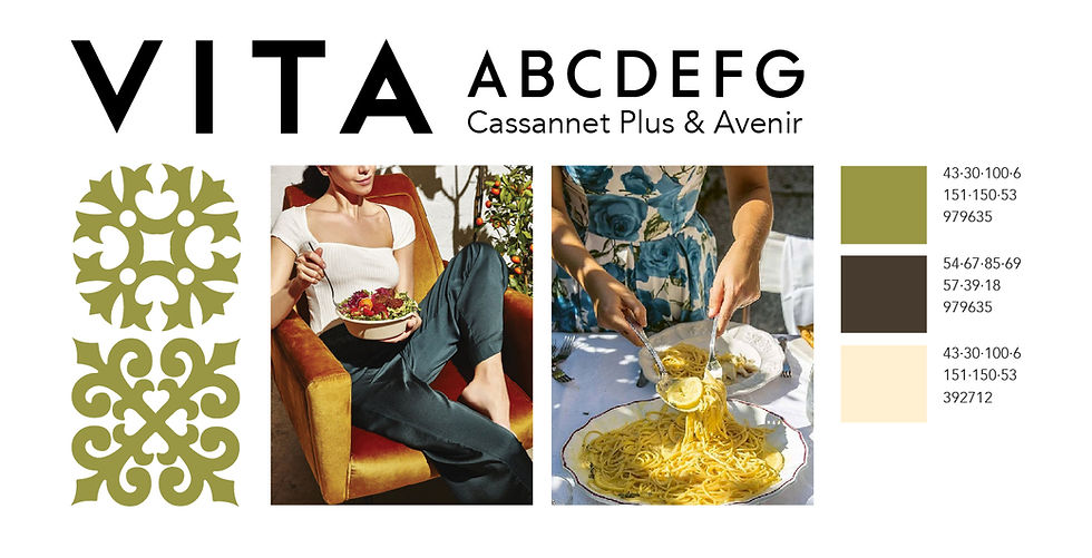
The typography is inspired by vintage European food and drink poster ads. The bright olive green color feels fresh and healthy, and the minimal palette gives Vita a modern impression. The Mediterranean tile pattern reminds the viewer of olive oil's rich cultural significance and widespread use. The imagery is saturated and warm-toned, conveying freshness as well as richness. The photos include people eating food, preparing food, laughing around a dinner table, etc. The focus is not on the food but rather the lifestyle and culture around eating in Mediterranean cultures.


Flat bottle sticker design and mockup